[HTML, CSS with JS] position 폭파시켜보자_2022.05.26.THU
9th DAY
position 폭파시켜보자
1. top배너 만들기 with positon:absolute(ref 던킨 사이트)
2. right배너 만들기 with positon:fixed(쇼핑몰에서 주로 사용)
3. 움직이는 sun, car, heart with @keyframes, animation
<!DOCTYPE html>
<html lang="ko">

<head>
    <meta charset="UTF-8">
    <meta http-equiv="X-UA-Compatible" content="IE=edge">
    <meta name="viewport" content="width=device-width, initial-scale=1.0">
    <title>Document</title>
    <link rel="stylesheet" href="../css/reset.css">
    <link rel="stylesheet" href="../css/position06.css">
    <script src="../js/jquery-1.12.4.min.js"></script>
    <script src="../js/position06.js"></script>

</head>

<body>
    <div class="top_banner">
        <div class="container">
            <h2>Lorem, ipsum dolor.
            </h2>
            <p>Lorem ipsum dolor, sit amet consectetur adipisicing elit. Debitis explicabo quam nam consequatur atque
                ex, reiciendis minima temporibus excepturi molestiae?</p>
        </div>
        <button><i class="xi-arrow-top"></i></button>


    </div>

    <header class="header">
        암 헤더
    </header>
    <ul class="right_banner">
        <li><i class="xi-bars"></i><span>Lorem, ipsum.</span></li>
        <li><i class="xi-close"></i><span>Lorem, ipsum.</span></li>
        <li><i class="xi-heart"></i><span>Lorem, ipsum.</span></li>

    </ul>
    <ul class="sun">
        <li></li>
        <li></li>
        <li></li>
        <li></li>
    </ul>

    <ul class="car">
        <li></li>
        <li></li>
        <li></li>
    </ul>
    <i class="xi-heart myheart"></i>
</body>

</html>
<!-- span은 인라인테크 -->
<html>
span은 inline 태그!
@import url('https://cdn.jsdelivr.net/npm/xeicon@2.3.3/xeicon.min.css');

.top_banner button::after {
  content: 'close';
}

.top_banner.active button::after {
  content: 'open';
}

.top_banner .container {
  width: 1200px;
  margin: 0 auto;
  height: 100px;
  overflow: hidden;
  transition: 0.4s;
}

.top_banner.active .container {
  height: 0;
}

.top_banner {
  position: relative;
}

.top_banner button {
  position: absolute;
  bottom: -20px;
  /* 포지션을 준 상태에서 탑이 없어서 바텀이 없어도 차이가 없는 것
    컨테이너 1200px을 만들었고, 포지션을 주면 탑, 바텀 값을 줘야함
    그래야 나중에 꼬이지 않음 */
  left: 50%;
  width: 100px;
  line-height: 20px;
  margin-left: 550px;
  background: #3f39;
  border: none;
  outline: none;
  cursor: pointer;
}
/* background: transparent; 백그라운드 색 빠짐
   cursor: pointer; 버튼에 마우스 올리면, 커서 모양이 손가락 모양으로 바뀜 */

.top_banner.active i {
  transform: rotate(180deg);
}

.header {
  line-height: 100vh;
  background: #333;
  color: #fff;
  text-align: center;
}

.right_banner {
  position: fixed;
  top: 50vh;
  right: -100px;
  background: #ff0;
  transition: right 0.5s;
  /* 0.5s에서 0생략 가능 */
  /* 백그라운드색만 줬을 떄는 화면의 길이만큼 색이 입혀지다가, position: absolute를 주니까 텍스트 사이즈만큼 쪼그라들었음(auto사이즈)=포지션의 기본 특징 " 쪼그라든다" fixed를 줘도 똑같음*/
}

/* .right_banner:hover {
  right: 0;
    }
  hover로도 오른쪽에서 팝업창이 나오게 할 수 있음*/

.right_banner.active {
  right: 0;
}

.sun {
  position: absolute;
  top: 300px;
  right: 300px;
  width: 100px;
  height: 100px;
  background: #f00;
  border-radius: 50%;
  animation: sun_move 2s infinite linear;
  /* infinite 계속 돌아라
  linear 등속 */
}

.sun li {
  position: absolute;
  width: 20px;
  height: 4px;
  background: #f00;
}

.sun li:nth-child(1) {
  top: 48px;
  left: -40px;
}

.sun li:nth-child(2) {
  top: 48px;
  left: 120px;
}

.sun li:nth-child(3) {
  top: -20px;
  left: 38px;
  transform: rotate(90deg);
}

.sun li:nth-child(4) {
  top: 120px;
  left: 38px;
  transform: rotate(90deg);
}

@keyframes sun_move {
  to {
    transform: rotate(360deg);
  }
}
/* 키프레임을 주고, 효과를 먹이는 곳에 가서 animation tag를 줘야함*/

.car {
  position: fixed;
  bottom: 50px;
  right: -300px;
  width: 200px;
  height: 100px;
  background: #ff0;
  border-radius: 50px 20px 0 0;
  animation: car_move 6s infinite linear;
}

/* 창문 */
.car li:nth-child(1) {
  position: absolute;
  top: 10px;
  left: 10px;
  width: 40px;
  height: 50px;
  background: #333;
  border-radius: 30px 0 0 0;
}

/* 앞바퀴 */
.car li:nth-child(2) {
  position: absolute;
  bottom: -15px;
  left: 20px;
  width: 30px;
  height: 30px;
  background: #f00;
  border-radius: 10px;
  animation: baki 1s infinite linear;
}

/* 뒷바퀴 */
.car li:nth-child(3) {
  position: absolute;
  bottom: -15px;
  right: 20px;
  width: 30px;
  height: 30px;
  background: #f00;
  border-radius: 10px;
  animation: baki 1s infinite linear;
}

@keyframes baki {
  to {
    transform: rotate(-360deg);
  }
}

@keyframes car_move {
  to {
    right: 2000px;
  }
}

.myheart {
  position: absolute;
  top: 250px;
  left: 250px;
  color: #198754;
  font-size: 50px;
  animation: heart 0.8s infinite;
}

@keyframes heart {
  to {
    transform: scale(3);
    opacity: 0;
  }
}
<css>
▪ (right_banner부분에서) background에 색만 주면 화면의 가로폭만큼 색이 입혀지다가, position: absolute/fixed를 주면 텍스트 사이즈
(사이즈 auto)만큼 "쪼그라든다-position의 기본 특징❗
▪ @keyframes 효과 주고, 효과를 먹이는 곳에 가서 animation: 키프레임 이름 / 몇 초 / infinite 계속 돌아라 / linear 등속tag를 해야한다.
▪ background: transparent; 백그라운드 색 빠짐
▪ cursor: pointer; 버튼에 마우스 올리면, 커서 모양이 손가락 모양으로 바뀜
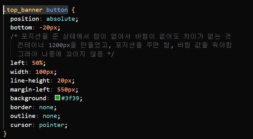
bottom: -20px을 지워도 변하는 부분이 없어서 굳이 안 넣어도 되는 거 아닌가 했는데, position을 준 상태에서 top이 없어서 bottom을 지워도 차이가 없었던 거였다.
container 1200px인 된 상태에서 position을 줄 때는 top, bottom 값을 줘야한다.
이렇게 하나 알아가고요, 정말 코딩의 세계 멀고도 험해 근데 이게 코딩의 매력 아니겠;;;🚬🚬
$(function() {
    $('.top_banner button').on('click', function() {
        $('.top_banner').toggleClass('active')
    });

    $('.right_banner').on('click', function() {
        $(this).toggleClass('active')
    })
})<JavaScript>
결과물 : http://127.0.0.1:5502/doc/position03.html
+ MEMO +
/ 는 잘 안 씀=루트로 가라
./ 나와 어깨를 나란히 하는 곳으로 가라
../ 부모 경로 찾아가라
ul은 li만 데리고 다님
ol도 li만 데리고 다님
strong-li 이건 안됨=h1이 20개 있는 거랑 같은 상황
▪ ul :리스트를 가지고 있는 tag(번호가 없는 list) ---li가 자식
▪ ol : 번호가 있는 리스트 ---li가 자식
▪ dl : 설명(description)을 리스트 형식으로 정의 ---dt(굵게 사용) dd가 자식
용어(term)나 이름(name)을 나타내는 dt요소와 해당 용어에 대한 설명을 나타내는 dd요소로 구성